This pie chart showed up in my RSS feed last week:
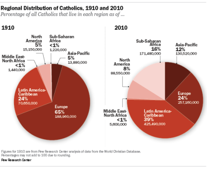
I think it is a great example of why pie charts are generally a bad way to visually portray data. I understand the allure. A circle is a good representation of a whole so subdividing it is an intuitive way to show proportional distribution. The problem is that its difficult to get a sense of relative proportion within a single pie chart, making sense of nondescript angles and areas. It's even more difficult to compare change between pie charts as we are asked to do above. First, while it may be easy to see the that one slice of pie is bigger in one than the other (e.g. "Europe" above), the sense of relative change is much tougher to determine. Second, the location of the comparable slices move from one chart to the next, making it even more difficult to follow change (e.g. "Latin America - Caribbean" above).
Then, I stumbled on the infographic below in a different article, which uses a different dataset but shows the same social trend. In my humble opinion, it is a complete CF. While I might be nostalgic for retro video games, the 16-bit feel comes across as cheap. A problem with maps is often that they are unnecessary. There is indeed a geographic argument being made with the data, but it is lost in the intentional distortion of the continents to match proportional shift.

Instead, I would argue to keep it simple (stupid) so here is a bar chart of the Pew data from the pie chart above:

The relative change within each continental group is much more obvious. This makes the argument that easier to understand: Europe has seen a huge decline in its relative share of Catholics while Africa and Latin America have seen big gains. This is Charts, Tables, and Graphics 101. Pie charts are confusing, and distortion maps are needlessly complex. Sophistication rarely imparts edification.
I think it is a great example of why pie charts are generally a bad way to visually portray data. I understand the allure. A circle is a good representation of a whole so subdividing it is an intuitive way to show proportional distribution. The problem is that its difficult to get a sense of relative proportion within a single pie chart, making sense of nondescript angles and areas. It's even more difficult to compare change between pie charts as we are asked to do above. First, while it may be easy to see the that one slice of pie is bigger in one than the other (e.g. "Europe" above), the sense of relative change is much tougher to determine. Second, the location of the comparable slices move from one chart to the next, making it even more difficult to follow change (e.g. "Latin America - Caribbean" above).
Then, I stumbled on the infographic below in a different article, which uses a different dataset but shows the same social trend. In my humble opinion, it is a complete CF. While I might be nostalgic for retro video games, the 16-bit feel comes across as cheap. A problem with maps is often that they are unnecessary. There is indeed a geographic argument being made with the data, but it is lost in the intentional distortion of the continents to match proportional shift.
Instead, I would argue to keep it simple (stupid) so here is a bar chart of the Pew data from the pie chart above:

The relative change within each continental group is much more obvious. This makes the argument that easier to understand: Europe has seen a huge decline in its relative share of Catholics while Africa and Latin America have seen big gains. This is Charts, Tables, and Graphics 101. Pie charts are confusing, and distortion maps are needlessly complex. Sophistication rarely imparts edification.
No comments:
Post a Comment